
A product being picked up is a useful observation, but it is not a completed purchase. Pickup analysis examines where and how often people take products from a display. Read it alongside the earlier shelf-funnel stages to choose a specific merchandising question to investigate.
Pickup, put-back and purchase are different events
A pickup means a product was taken from its display position. A put-back means it was returned. A purchase is a completed transaction. A person may pick up several items, handle one item repeatedly or carry it elsewhere, so pickup events, people and units sold are not interchangeable.
Confirm which events the installed setup measures, its camera coverage and how repeated handling is counted. Do not derive sales simply by subtracting put-backs from pickups: an unobserved return or a product moved out of view can change that interpretation. SKU-level purchases require matching transaction data and compatible measurement units.
Read the stages on the same terms
saai insight's shelf analysis presents visit, exposure, exploration and pickup signals by display or shelf. These are observation categories. A signal labelled exploration does not, by itself, establish someone's preference or reason for shopping.
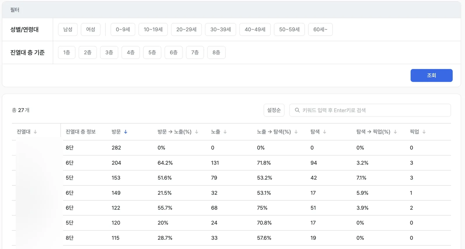
Each row represents a display. Check the period, observation coverage and count behind a rate before comparing rows. Store and product names are masked in the existing screen; the interface shown is Korean.
For an exploration-to-pickup rate, use pickups divided by explorations only when both counts follow the same unit and qualifying rules. If one counts actions and the other counts people, confirm the metric definition before dividing them.
A calculation example
In this hypothetical example, 40 people explored a shelf and 8 of those people picked up a product during the same period. The exploration-to-pickup rate is 8 ÷ 40 × 100 = 20%. This example counts people once at each stage. It does not describe every product configuration, and the 20% is not a purchase conversion rate.
A low rate can suggest questions about reach, price information, available stock or the product itself. It does not identify one cause automatically. Check the shelf before deciding which explanation to test.
Change one condition and compare again
If a price label is hard to read, clarify it while keeping the product placement stable. Record the date, stock availability, price and any concurrent promotion. Compare similar weekdays and periods using the same funnel rules.
Use the shelf heatmap to locate the area to inspect and the planogram guide to record the intended display. Review pickup counts as well as rates afterward. To examine sales, use the separate definitions in purchase conversion analysis.
Where the product fits
The analysis helps a merchandising team narrow down which display and stage need attention. The team still checks stock and display conditions, selects a change and evaluates the result. A higher pickup rate alone is not evidence of increased revenue.
Explore shelf analysis in saai insight to compare behavior signals across displays on a shared basis.
