Blog
Insights & Guides
43 articles on privacy AI, video anonymization, and spatial data.
Capture rate — the first number that tells a location problem from a store problem
When revenue falls short, the first argument is always 'is it the location, or is it the store?' POS data can't answer that. The capture rate — footfall outside counted against the customers who walk in — can.

The real difference hiding behind the average
A store-wide average flattens the different reactions of different customer groups into one number. Split by gender and age, and the real difference shows up.

Design the report around the question you actually have
A fixed report template doesn't always answer the exact question you're trying to ask. Set your own conditions and pull it into a single report instead.

Did that event actually work
Once an event wraps, it's easy to judge success by feel alone. Auto-collect visits, dwell, and interest during the event window, and you can compare it in numbers instead.

Walking past isn't the same as watching
The people who walk past your in-store ad and the people who actually watch it aren't the same group. You have to measure viewing rate separately to put a number on ad performance.

How many actually opened their wallet
Break actual purchase rate against total visitors down by gender and age, and it tells you who to target in your next campaign.

Proving it down to a single shelf, in numbers
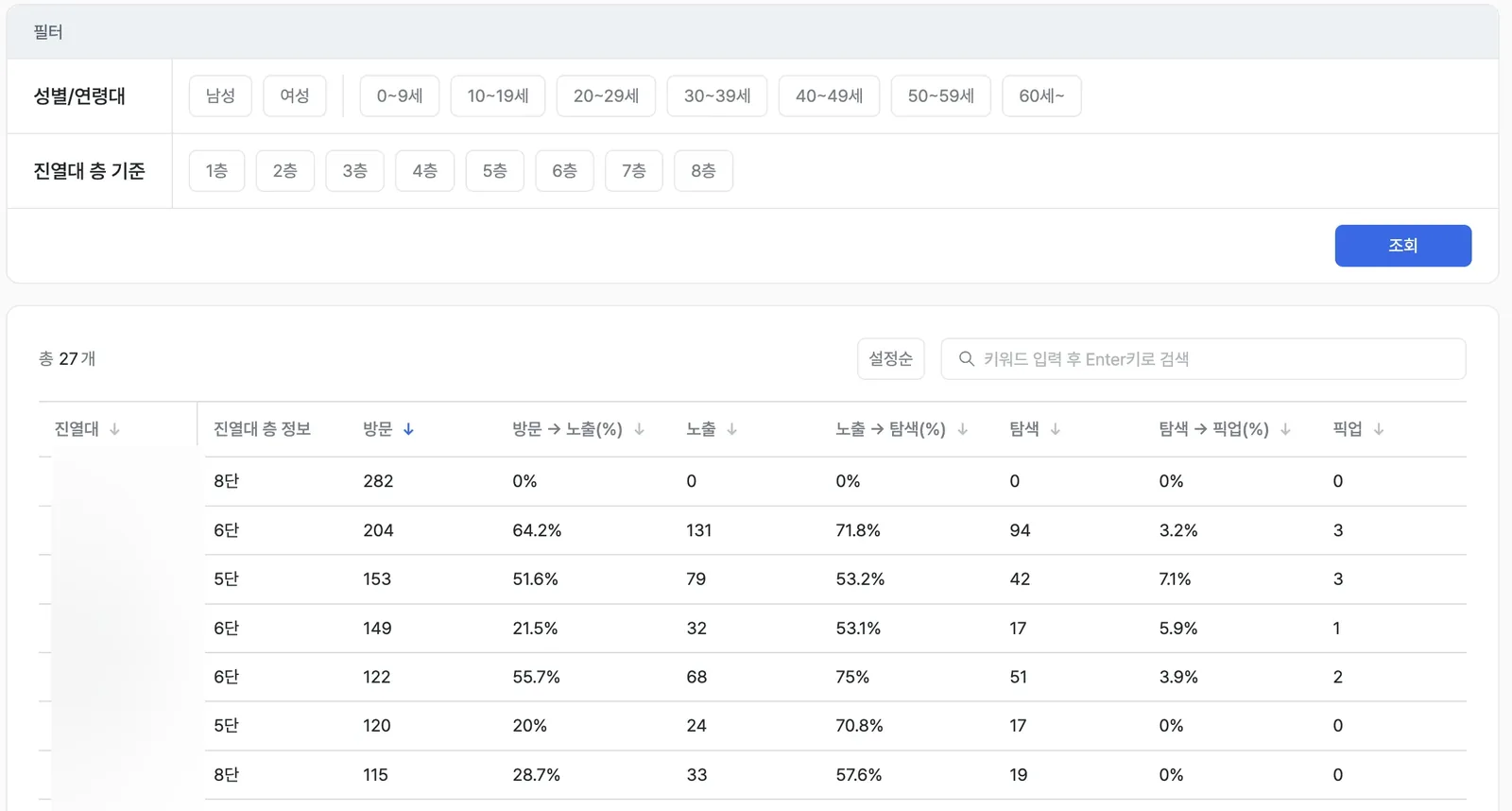
A display's overall average can't tell you which shelf is the problem. Break visit-to-pickup into four stages at the shelf level, and the answer shows up.

Where exactly are you losing them
The path from visit to purchase never happens in one step. You only find the bottleneck by breaking conversion out stage by stage.
Even inside one display, shelves aren't created equal
The top and middle shelves of the same display get different attention and different pickups. A shelf-level heatmap finds the golden zone.
A case like this can happen in your space too.
Request a consultationMore visits doesn't always mean better
Judge a display's performance by visitor count alone and you'll miss the hidden gems. You only see real interest when you read visits and dwell rate together.

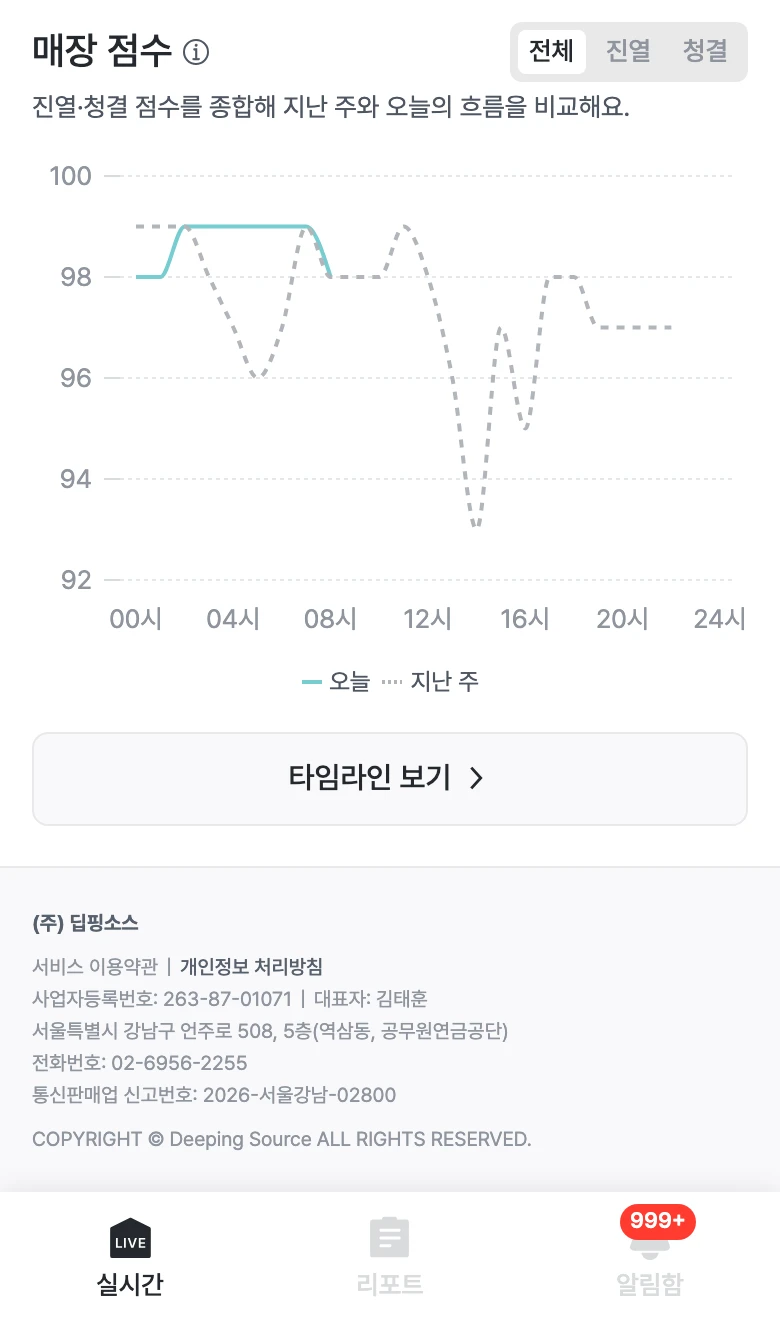
The store flows differently every hour
The busiest zone in a store keeps shifting throughout the day. Play the heatmap back in order, and that whole flow becomes visible at once.

Interest becomes visible through color alone
Map customer movement onto the store floor plan in color, and it's easy to spot the difference between a crowded zone and a zone that actually held people's attention.
A complicated path, reduced to one flow
Lay out every path between displays and there's nothing left to read. A Sankey chart leaves only the flow that matters, using thickness alone.

The one route most people follow
You can't look at every path through a store one by one. The single route most customers actually followed tells you exactly where to concentrate your key resources.

Where do customers actually move
Visualize movement between zones as arrows, and it becomes obvious whether your related-product placement is actually working as a path.

Following one person's footsteps
Reconstruct one visitor's path through the store, and it surfaces drop-off points the averages never show.

Splitting the store into zones is what reveals the answer
Split the store into zones and compare visitor count and dwell time, and the same store starts showing its hot zones and cold zones.

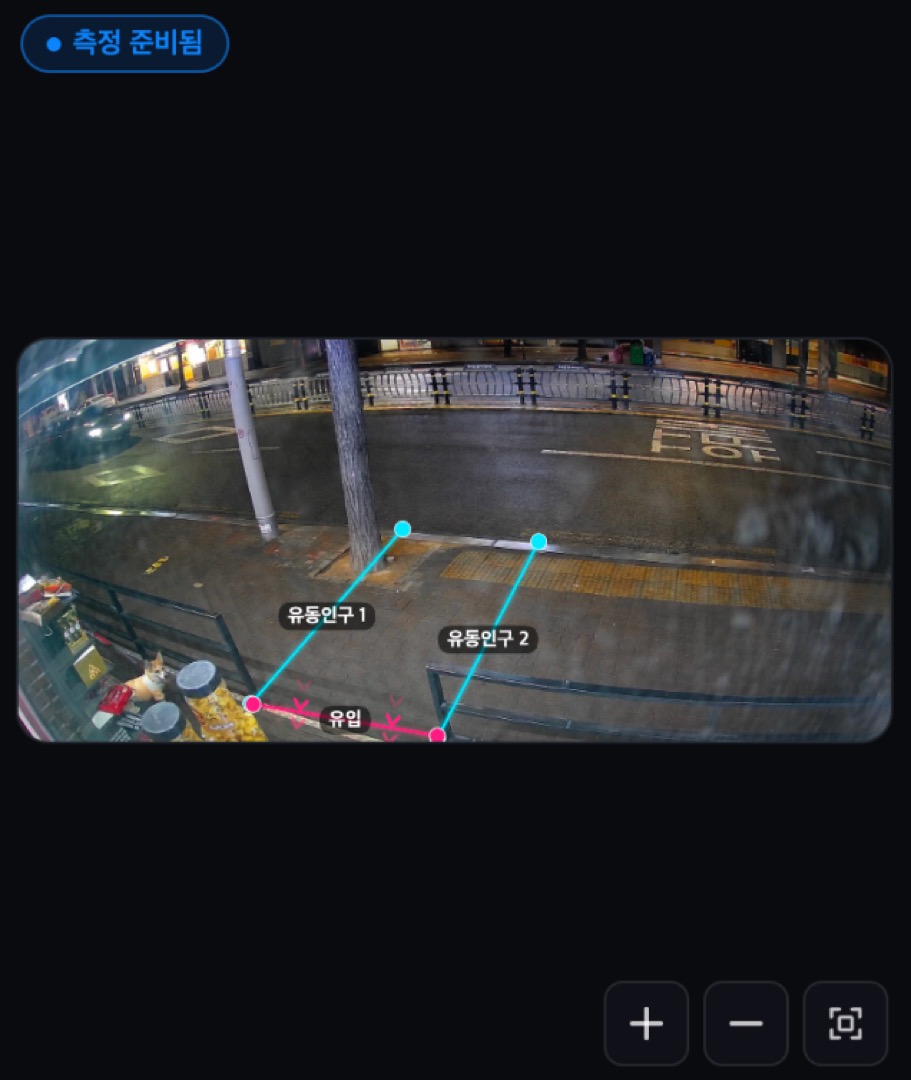
One line proves where the traffic actually went
Draw a virtual line at each entrance and auto-count who crosses it, and it becomes clear exactly where to put your resources first.