
Even in the same store, morning and afternoon crowd different zones. A heatmap from a single moment is easy to misread because of that. The hourly heatmap timelapse shows you the entire day as one continuous flow.
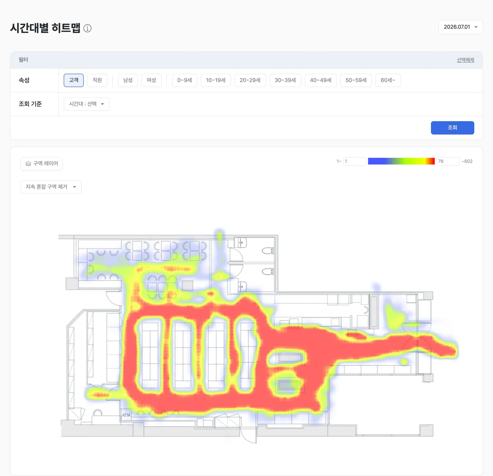
Change the hour and the same floor plan colors differently. The hour that shades unlike the others is the one worth checking. The product UI shown is the Korean build.
What it shows
It replays customer activity in one-hour increments, showing when and where the store gets busy or quiets down. You can pause on a single moment or watch the whole day play out.
If a zone that's usually red turns blue on a given day, that's a sign something in that time slot is worth checking.
When to use it
Use it to plan staffing and inventory placement for peak times, and to build hour-specific targeted marketing.
A worked example
Here's an example. Say a home-appliance corner shows up unusually red at 3pm on weekends. Trace the traffic in with the representative path, diagnose the cause with zone interest analysis, then concentrate staff and POP materials for that time slot.
Which features to read it with
One feature alone rarely gets you to the cause. The pattern that repeats is: overlay a second feature to narrow the cause, act, then re-measure with a third.
- Measure — Overlay the busy hour with zone-to-zone traffic to pin down which segment the congestion starts in.
- Act — Concentrate staff and POP materials in that segment during those hours.
- Verify — Use custom report to group the same hours next week and compare.
This is an illustrative scenario: a hypermarket where one aisle stayed congested only on Saturday afternoons.
If a zone that's usually red turns blue, that time slot needs a closer look. Check out the hourly heatmap in saai insight.
