
A visit funnel breaks the journey through a store into observable stages. It helps an operations team see where participation changes and decide what to inspect. It does not reveal a visitor's intention or turn every observed action into a confirmed purchase.
Define the journey you want to examine
Start with one question, such as whether visitors reach a display and then interact with it. Customer behavior analysis uses signals such as movement, dwell and product interaction to examine that question. These signals show what was observed; explanations such as confusion, preference or dissatisfaction remain hypotheses.
A store-level funnel and a shelf-level funnel use different boundaries. Do not combine a whole-store visit total with activity from one small display without naming the scope. Write down the area, stage condition, period and counting unit for each step.
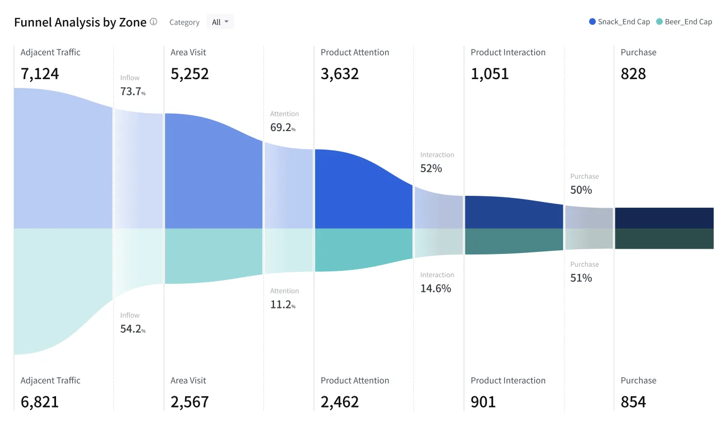
The existing screen shows how counts differ by stage; the interface is Korean. A narrowing band is a place to investigate. Its width alone does not show why someone did not proceed. Check the definition behind labels such as purchase before treating them as transaction data.
Keep the denominator visible
An adjacent-stage rate divides the qualifying count at one stage by the comparable count at the preceding stage. An overall rate uses the first stage as its denominator. Both can be useful, but they answer different questions.
In a hypothetical cohort of 100 visitors, 50 reach the selected display and 10 of those 50 pick up a product. Each person is counted once at each stage, within the same period.
- How many visitors reached the display? 50 ÷ 100 × 100 = 50%
- How many who reached it picked something up? 10 ÷ 50 × 100 = 20%
- How many of all visitors picked something up? 10 ÷ 100 × 100 = 10%
None of these is a purchase rate. Nor does this example establish that every installation links all stages to the same cohort. If stages are independently aggregated, check whether they share a comparable population. A stage difference is not automatically a count of people who abandoned a purchase.
Choose a check before choosing a fix
If few visitors reach a display, examine its visibility and the route to it. If many reach it but few interact, inspect stock, access, price information and product context. The largest drop is not always the most valuable place to intervene: consider the underlying count and the cost of a change too.
Use shelf analysis for display-level detail and visitor analysis for the period's traffic baseline. These views help narrow the question; they do not establish the cause on their own.
What saai insight contributes
saai insight brings visits, movement, dwell and conversion signals into the same analysis context. After identifying a stage to investigate, an operator can inspect the area, record a limited change and compare similar periods using unchanged stage definitions.
For a sales question, check observed checkout activity versus POS transactions. The unit, time window and integration scope must support the comparison. Do not equate being near a checkout with completing a payment.
Before changing a display, write one sentence stating the stage, the observation and the check you will make. Explore the relevant analysis views in saai insight.
