
A zone that a lot of visitors walked through and a zone that actually caught their interest aren't always the same place. Numbers alone make that difference hard to see. Color, in a heatmap, makes it obvious.
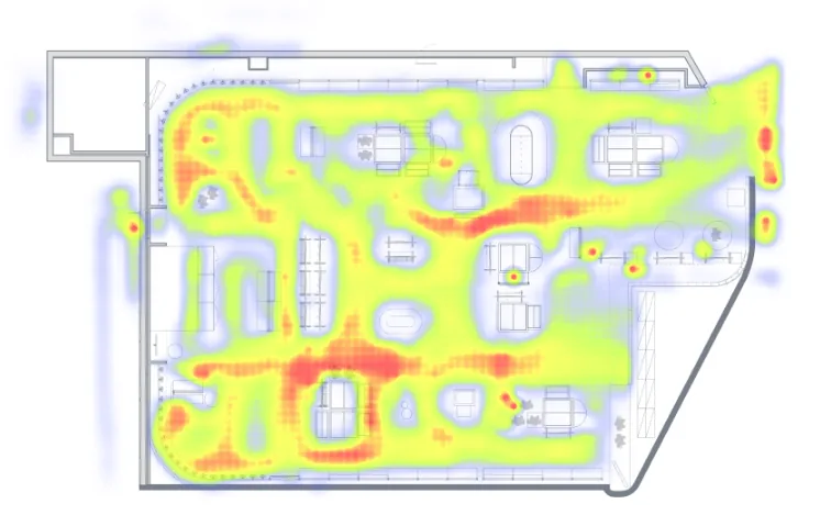
Red is where people passed most. If only the aisles are red while the display fronts stay blue, that zone was walked past, not shopped. The product UI shown is the Korean build.
What it shows
The heatmap visualizes customer traffic on the store map in color, and separately provides a heatmap built only from customers who stayed past a set duration. You can compare a visit heatmap against a pickup heatmap side by side.
A display that's red on the visit heatmap but blue on the pickup heatmap is a "look but don't touch" zone. Start by checking the price tag and product info card.
When to use it
Use it to identify crowded zones versus zones that get little exposure, and to maximize how the space is used.
A worked example
Here's an example. Say one display shows up red on the visit heatmap but stays blue on the pickup heatmap. That means plenty of people pass by, but few actually pick up the product. Reinforce the price tag and product info card, then check next week's heatmap again to see the change.
Which features to read it with
One feature alone rarely gets you to the cause. The pattern that repeats is: overlay a second feature to narrow the cause, act, then re-measure with a third.
- Measure — Overlay the red zones with zone interest analysis to separate crowding from actual interest.
- Act — Change the price tag, the product info card, and the display method.
- Verify — Use funnel analysis to re-measure whether it carried through to pickup.
Plenty of people stopped, but few picked up the product. That's a failed purchase conversion. To see how this pattern shifts by hour, continue with the hourly heatmap timelapse; for shelf-level differences inside a single display, see the shelf heatmap. Check out the heatmap in saai insight.
