
The same zone doesn't mean the same thing to every customer. A store-wide average buries that difference completely.
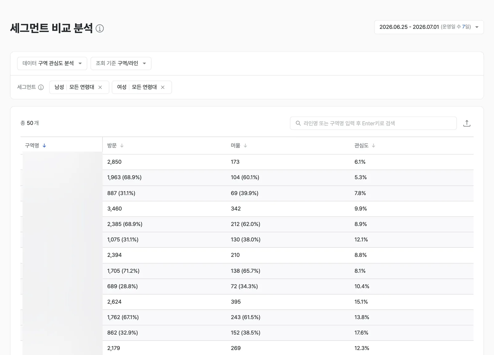
Each zone splits into a male and a female row. A zone whose total interest looks ordinary but whose two rows diverge sharply is where to split the targeting. Names that would identify the store or its products are masked. The product UI shown is the Korean build.
What it shows
Segment comparison breaks down zone-level visit, dwell, and interest data by visitor group, such as gender and age, so you can compare them. The same zone can be viewed separately for each group.
The same zone can be a star for one group and a question mark for another. Without splitting by group, that difference disappears into the average.
When to use it
Use it for precision targeted marketing and personalization strategy that concentrate resources on your core target group.
A worked example
Here's an example. Say the color-cosmetics corner is a "star zone" for women in their 20s but a "question-mark zone" for men in their 40s. Design different merchandising and promotional messaging by gender and age, and you can tailor the approach to each group.
Which features to read it with
One feature alone rarely gets you to the cause. The pattern that repeats is: overlay a second feature to narrow the cause, act, then re-measure with a third.
- Measure — Overlay the group differences with the shelf heatmap to see which shelf the gap opens on.
- Act — Design the display mix and promotional messaging separately per target group.
- Verify — Use shelf analysis to re-measure pickup rate per target group.
This is an illustrative scenario: a color-cosmetics corner where group differences were known only by a manager's instinct.
The same zone can be a star for women in their 20s and a question mark for men in their 40s. To see the full zone picture before splitting into groups, see zone analysis. Check out segment comparison in saai insight.
