
Placing a related product next to a new arrival doesn't mean customers actually follow that path. You only know by checking movement between zones directly.
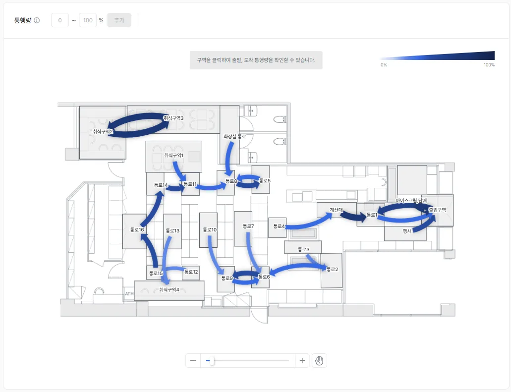
Arrow thickness and darkness are the volume. Where thick arrows converge is where a backup starts. The product UI shown is the Korean build.
What it shows
Zone-to-zone traffic reports how many customers move from one zone to another, by count and by rate. Movement is drawn as arrows, so you can compare volume at a glance by thickness.
If the arrow along your intended cross-merchandising path is thin, that display isn't translating into an actual customer path. Reconsider the placement.
When to use it
Use it to set the best position for a promoted product, or to run marketing at key spots matched to customer characteristics.
A worked example
Here's an example. Say the arrow from "new-arrivals zone to checkout" is thick, but "new-arrivals zone to accessories zone" is thin. That means the related-product placement you intended isn't turning into an actual path. Reposition the display, then compare movement on the same route again to check for improvement.
Which features to read it with
One feature alone rarely gets you to the cause. The pattern that repeats is: overlay a second feature to narrow the cause, act, then re-measure with a third.
- Measure — Overlay traffic volume with the hourly heatmap to pin down both the segment and the hour where the backup starts.
- Act — Concentrate cart-clearing staff and greeters in that segment during those hours.
- Verify — Use custom report to group the same hours next week and compare whether the backup eased.
This is an illustrative scenario: a hypermarket where one aisle stayed congested only on Saturday afternoons.
Wherever the arrow gets thicker is where the next product belongs. Curious about the single most common route across the whole store? Continue with the representative path. Check out zone-to-zone traffic in saai insight.
